|
Okay, that's a bit of an exaggeration, but there’s a quirky mathematical result related to these deals which means the target loss cost can often end up clustering in a certain range. Let’s set up a dummy deal and I’ll show you what I mean.

Source: Jim Linwood, Petticoat Lane Market, https://www.flickr.com/photos/brighton/4765025392
I found this photo online, and I think it's a cool combo - it's got the modern City of London (the Gherkhin), a 60s brutalist-style estate (which when I looked it up online has been described as "a poor man's Barbican Estate"), and a street market which dates back to Tudor times (Petticoat lane). When chain ladders goes wrong8/2/2024 I received a chain ladder analysis a few days ago that looked roughly like the triangle below, but there's actually a bit of a problem with how the method is dealing with this particular triangle, have a look at see if you can spot the issue. 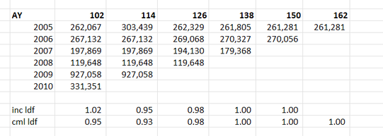
I’ve had the textbook 'Modelling Extremal Events: For Insurance and Finance’ sat on my shelf for a while, and last week I finally got around to working through a couple of chapters. One thing I found interesting, just around how my own approach has developed over the years, is that even though it’s quite a maths heavy book my instinct was to immediately build some toy models and play around with the results. I recall earlier in my career, when I had just got out of a 4-year maths course, I was much more inclined to understand new topics via working through proofs step-by-step in long hand, pen to paper.
In case it’s of interest to others, I thought I’d upload my Excel version I built of the classic ruin process. In particular I was interested in how the Cramer-Lundberg theorem fails for sub-exponential distributions (which includes the very common Lognormal distribution). Therefore the Spreadsheet contains a comparison of this theorem against the correct answer, derived from monte carlo simulation. The Speadsheet can be found here: https://github.com/Lewis-Walsh/RuinTheoryModel The first tab uses an exponential distribution, and the second uses a Lognormal distribution. Screenshot below. I also coded a similar model in Python via Jupyter Notebook, which you can read about below. 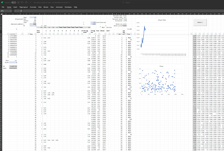
I was thinking more about the post I made last week, and I realised there’s another feature of the graphs that is kind of interesting. None of the graphs adequately isolates what we in insurance would term ‘severity’ inflation. That is, the increase in the average individual verdict over time.
You might think that the bottom graph of the three, tracking the ‘Median Corporate Nuclear Verdict’ does this. If verdicts are increasing on average year by year due to social inflation, then surely the median nuclear verdict should increase as well right?!? Actually, the answer to this is no. Let's see why. 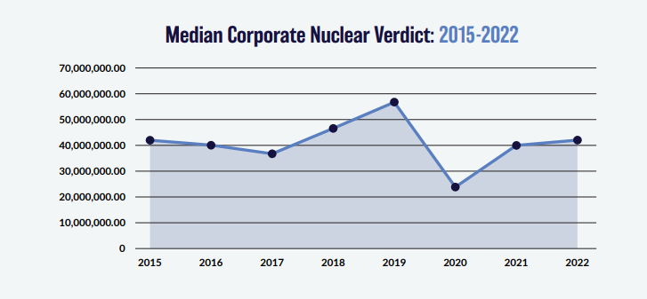
Nuclear Verdicts and shenanigans with graphs18/10/2023 If you have seen the below graphs before, it’s probably because they've cropped up quite a few times in various insurance articles recently. 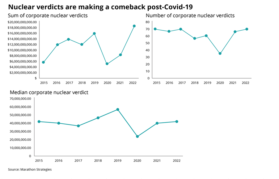 They were used by IBNR Weekly [2], Insurance Insider [3], Munich Re [4], Lockton Re [5], and those were just the ones I could remember or which I found with a 5 minute search. The graphs themselves are originally from a report on US social inflation by an organisation called Marathon Strategies (MS for short in the rest of the post) [1].
It's an interesting way of analyzing social inflation, so I recreated their analysis, which lead me to realize MS may have been a little creative in how they’ve presented the data, let me explain.
I previously wrote a post in which I backtested a method of deriving large loss inflation directly from a large loss bordereux. This post is an extension of that work, so if you haven't already, it's probably worth going back and reading my original post. Relevant link:
www.lewiswalsh.net/blog/backtesting-inflation-modelling-median-of-top-x-losses In the original post I slipped in the caveat that that the method is only unbiased if the underlying exposure doesn’t changed over the time period being analysed. Unfortunately for the basic method, that is quite a common situation, but never fear, there is an extension to deal with the case of changing exposure. Below I’ve written up my notes on the extended method, which doesn't suffer from this issue. Just to note, the only other reference I’m aware of is from the following, but if I've missed anyone out, apologies! [1] 
St Paul's, London. Photo by Anthony DELANOIX
What is a 'Net' Quota Share?7/10/2022 I recently received an email from a reader asking a couple of questions : "I'm trying to understand Net vs Gross Quota shares in reinsurance. Is a 'Net Quota Share' always defining a treaty where the reinsurer will pay ceding commissions on the Net Written Premium? ... Are there some Net Quota Shares where the reinsurer caps certain risks (e.g. catastrophe)?" It's a reasonable question, and the answer is a little context dependent, full explanation given below.  Source: https://unsplash.com/@laurachouette, London
(As an aside, in the last couple of weeks, the UK has lurched from what was a rather pleasant summer into a fairly chilly autumn, to mirror this, here's a photo of London looking a little on the grey side.) I wrote a quick script to backtest one particular method of deriving claims inflation from loss data. I first came across the method in 'Pricing in General Insurance' by Pietro Parodi [1], but I'm not sure if the method pre-dates the book or not. In order to run the method all we require is a large loss bordereaux, which is useful from a data perspective. Unlike many methods which focus on fitting a curve through attritional loss ratios, or looking at ultimate attritional losses per unit of exposure over time, this method can easily produce a *large loss* inflation pick. Which is important as the two can often be materially different. 
Source: Willis Building and Lloyd's building, @Colin, https://commons.wikimedia.org/wiki/User:Colin
Quota Share contracts generally deal with acquisition costs in one of two ways - premium is either ceded to the reinsurer on a ‘gross of acquisition cost’ basis and the reinsurer then pays a large ceding commission to cover acquisition costs and expenses, or premium is ceded on a ‘net of acquisition’ costs basis, in which case the reinsurer pays a smaller commission to the insurer, referred to as an overriding commission or ‘overrider’, which is intended to just cover internal expenses. Another way of saying this is that premium is either ceded based on gross gross written premium, or gross net written premium. I’ve been asked a few times over the years how to convert from a gross commission basis to the equivalent net commission basis, and vice versa. I've written up an explanation with the accompanying formulas below.  Source: @ Kuhnmi, Zurich
It's still very early days to understand the true fallout from Russia's invasion of Ukraine, but I thought it would be interesting to tally a few of the estimates for the insured loss we've seen so far, all of the below come from the Insider. Please note, I'm not endorsing any of these estimates, merely collating them for the interested reader!  Kiv Perchersk Lavra Monastery, Kyiv. @Andriy155
Cefor Exposure Curves - follow up7/3/2022 The Cefor curves provide quite a lot of ancillary info, interestingly (and hopefully you agree since you're reading this blog), had we not been provided with the 'proportion of all losses which come from total losses', we could have derived it by analysing the difference between the two curves (the partial loss and the all claims curve) Below I demonstrate how to go from the 'partial loss' curve and the share of total claims % to the 'all claims' curve, but you could solve for any one of the three pieces of info given two of them using the formulas below.  Source: Niels Johannes https://commons.wikimedia.org/wiki/File:Ocean_Countess_(2012).jpg
Cefor Exposure Curves3/3/2022 I hadn't see this before, but Cefor (the Nordic association of Marine Insurers), publishes Exposure Curves for Ocean Hull risks. Pretty useful if you are looking to price Marine RI. I've included a quick comparison to some London Market curves below and the source links below. 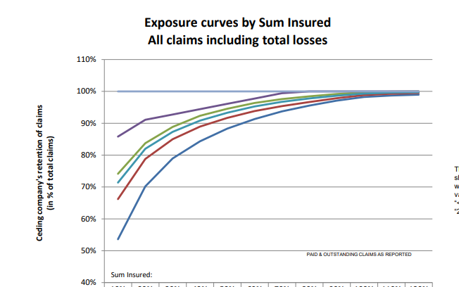 This post is a follow up to two previous posts, which I would recommend reading first: https://www.lewiswalsh.net/blog/german-flooding-tail-position https://www.lewiswalsh.net/blog/german-flooding-tail-position-update Since our last post, the loss creep for the July 2021 German flooding has continued, sources are now talking about a EUR 8bn (\$9.3bn) insured loss. [1] This figure is just in respect of Germany, not including Belgium, France, etc., and up from \$8.3bn previously. But interestingly (and bear with me, I promise these is something interesting about this) when we compare this \$9.3bn loss to the OEP table in our previous modelling, it puts the flooding at just past a 1-in-200 level.  Photo @ Jonathan Kemper - https://unsplash.com/@jupp
Here are two events that you might think were linked: Every year around the month of May, the National Oceanic and Atmospheric Administration (NOAA) releases their predictions on the severity of the forthcoming Atlantic Hurricane season. Around the same time, US insurers will be busy negotiating their upcoming 1st June or 1st July annual reinsurance renewals with their reinsurance panel. At the renewal (for a price to be negotiated) they will purchase reinsurance which will in effect offload a portion of their North American windstorm risk. You might reasonably think – ‘if there is an expectation that windstorms will be particularly severe this year, then more risk is being transferred and so the price should be higher’. And if the NOAA predicts an above average season, shouldn’t we expect more windstorms? In which case, wouldn't it make sense if the pricing zig-zags up and down in line with the NOAA predictions for the year? Well in practice, no, it just doesn’t really happen like that. 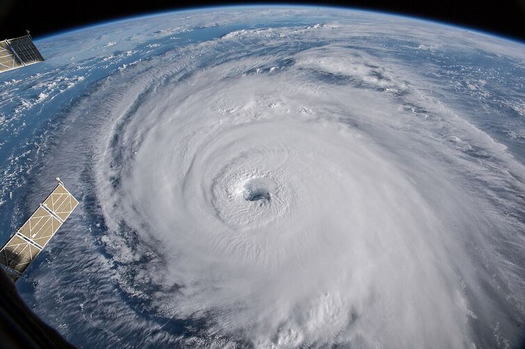 Source: NASA - Hurricane Florence, from the International Space Station
German Flooding - tail position23/7/2021 As I’m sure you are aware July 2021 saw some of the worst flooding in Germany in living memory. Die Welt currently has the death toll for Germany at 166 [1]. Obviously this is a very sad time for Germany, but one aspect of the reporting that caught my attention was how much emphasis was placed on climate change when reporting on the floods. For example, the BBC [2], the Guardian [3], and even the Telegraph [4] all bring up the role that climate change played in the contributing to the severity of the flooding. The question that came to my mind, is can we really infer the presence of climate change just from this one event? The flooding has been described as a ‘1-in-100 year event’ [5], but does this bear out when we analyse the data, and how strong evidence is this of the presence of climate change?  Image - https://unsplash.com/@kurokami04
|
AuthorI work as an actuary and underwriter at a global reinsurer in London. Categories
All
Archives
April 2024
|
 RSS Feed