|
On why it doesn’t really make sense to fit a Pareto distribution with a method of moments.
I was sent some large loss modelling recently by another actuary for a UK motor book. In the modelling, they had taken the historic large losses, and fit a Pareto distribution using a method of moments. I thought about it for a while and realized that it didn't really like the approach for a couple of reasons which I'll go into in more detail below, but then when I thought about it some more I realised I'd actually seen the exact approach before ... in an IFoA exam paper. So even though the method has some shortcomings, it is actually a taught technique. [1]

Following the theme from last time, of London's old vs new side by side. Here's a cool photo which shows the old royal naval college in Greenwich, with Canary Wharf in the background. Photo by Fas Khan
Okay, that's a bit of an exaggeration, but there’s a quirky mathematical result related to these deals which means the target loss cost can often end up clustering in a certain range. Let’s set up a dummy deal and I’ll show you what I mean.

Source: Jim Linwood, Petticoat Lane Market, https://www.flickr.com/photos/brighton/4765025392
I found this photo online, and I think it's a cool combo - it's got the modern City of London (the Gherkhin), a 60s brutalist-style estate (which when I looked it up online has been described as "a poor man's Barbican Estate"), and a street market which dates back to Tudor times (Petticoat lane). Elon Musk's pay deal26/2/2024 As a rule of thumb, news outlets like the Guardian [1] or BBC News [2] don't typically report on the decisions of the Delaware Court of Chancery, a fairly niche 'court of equity' which decides matters of corporate law in the state of Delaware. That is of course, unless those decisions involve Elon Musk. Recently, the Delaware court handed down a judgement which voided a /$56bn pay-out which was due to Musk for his role as Tesla’s CEO. The reasoning behind striking it down is quite legal and technical, and not really my area of expertise but Matt Levine has a good write up for those interested. [3] What I am interested in is thinking about how we would assess the fairness of the pay-out. Now fairness is a slippery concept, but I'm going to present one angle, which I've haven't seen discussed elsewhere yet, which I think is one possible way of framing the situation.  Source: https://en.m.wikipedia.org/wiki/File:Roadster_2.5_charging.jpg
When chain ladders goes wrong8/2/2024 I received a chain ladder analysis a few days ago that looked roughly like the triangle below, but there's actually a bit of a problem with how the method is dealing with this particular triangle, have a look at see if you can spot the issue. 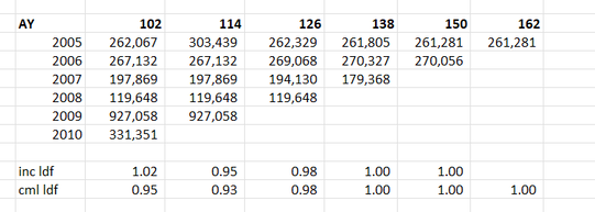
I’ve had the textbook 'Modelling Extremal Events: For Insurance and Finance’ sat on my shelf for a while, and last week I finally got around to working through a couple of chapters. One thing I found interesting, just around how my own approach has developed over the years, is that even though it’s quite a maths heavy book my instinct was to immediately build some toy models and play around with the results. I recall earlier in my career, when I had just got out of a 4-year maths course, I was much more inclined to understand new topics via working through proofs step-by-step in long hand, pen to paper.
In case it’s of interest to others, I thought I’d upload my Excel version I built of the classic ruin process. In particular I was interested in how the Cramer-Lundberg theorem fails for sub-exponential distributions (which includes the very common Lognormal distribution). Therefore the Spreadsheet contains a comparison of this theorem against the correct answer, derived from monte carlo simulation. The Speadsheet can be found here: https://github.com/Lewis-Walsh/RuinTheoryModel The first tab uses an exponential distribution, and the second uses a Lognormal distribution. Screenshot below. I also coded a similar model in Python via Jupyter Notebook, which you can read about below. 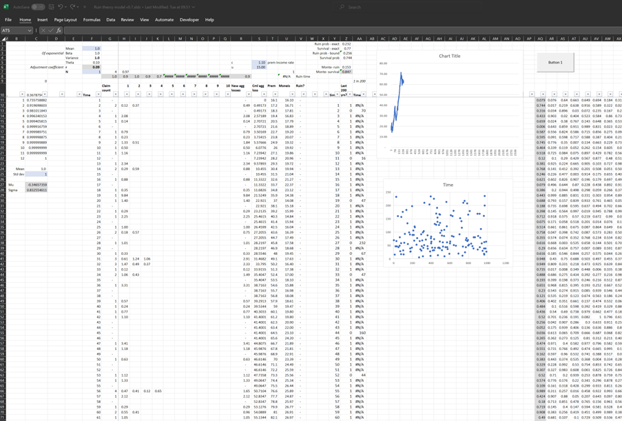
I was thinking more about the post I made last week, and I realised there’s another feature of the graphs that is kind of interesting. None of the graphs adequately isolates what we in insurance would term ‘severity’ inflation. That is, the increase in the average individual verdict over time.
You might think that the bottom graph of the three, tracking the ‘Median Corporate Nuclear Verdict’ does this. If verdicts are increasing on average year by year due to social inflation, then surely the median nuclear verdict should increase as well right?!? Actually, the answer to this is no. Let's see why. 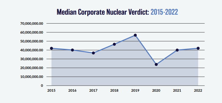
We previously introduced a method of deriving large loss claims inflation from a large loss claims bordereaux, and we then spent some time understanding how robust the method is depending on how much data we have, and how volatile the data is. In this post we're finally going to play around with making the method more accurate, rather than just poking holes in it. To do this, we are once again going to simulate data with a baked-in inflation rate (set to 5% here), and then we are going to vary the metric we are using to extract an estimate of the inflation from the data. In particular, we are going to look at using the Nth largest loss by year, where we will vary N from 1 - 20. 
Photo by Julian Dik. I was recently in Losbon, so here is a cool photo of the city. Not really related to the blog post, but to be honest it's hard thinking of photos with some link to inflation, so I'm just picking nice photos as this point!
We've been playing around in the last few posts with the 'Nth largest' method of analysing claims inflation. I promised previously that I would look at the effect of increasing the volatility of our severity distribution when using the method, so that's what we are going to look at today. Interestingly it does have an effect, but it's actually quite a subdued one as we'll see.

I'm running out of ideas for photos relating to inflation, so here's a cool random photo of New York instead. Photo by Ronny Rondon
In the last few posts I’ve been writing about deriving claims inflation using an ‘N-th largest loss’ method. The thought popped into my head after posting, that I’d made use of a normal approximation when thinking about a 95% confidence interval, when actually I already had the full Monte Carlo output, so could have just looked at the percentiles of the estimated inflation values directly.
Below I amend the code slightly to just output this range directly. 
Continuing my inflation theme, here is another cool balloon shot from João Marta Sanfins
In my last couple of post on estimating claims inflation, I’ve been writing about a method of deriving large loss inflation by looking at the median of the top X losses over time. You can read the previous posts here:
Part 1: www.lewiswalsh.net/blog/backtesting-inflation-modelling-median-of-top-x-losses Part 2: www.lewiswalsh.net/blog/inflation-modelling-median-of-top-10-losses-under-exposure-growth One issue I alluded to is that the sampling error of the basic version of the method can often be so high as to basically make the method unusable. In this post I explore how this error varies with the number of years in our sample, and try to determine the point at which the method starts to become practical. 
Photo by Jøn
I previously wrote a post in which I backtested a method of deriving large loss inflation directly from a large loss bordereux. This post is an extension of that work, so if you haven't already, it's probably worth going back and reading my original post. Relevant link:
www.lewiswalsh.net/blog/backtesting-inflation-modelling-median-of-top-x-losses In the original post I slipped in the caveat that that the method is only unbiased if the underlying exposure doesn’t changed over the time period being analysed. Unfortunately for the basic method, that is quite a common situation, but never fear, there is an extension to deal with the case of changing exposure. Below I’ve written up my notes on the extended method, which doesn't suffer from this issue. Just to note, the only other reference I’m aware of is from the following, but if I've missed anyone out, apologies! [1] 
St Paul's, London. Photo by Anthony DELANOIX
Capped or uncapped estimators9/6/2023 I was reviewing a pricing model recently when an interesting question came up relating to when to apply the policy features when modelling the contract.  Source: Dall.E 2, Open AI.
I thought it would be fun to include an AI generated image which was linked to the title 'capped vs uncapped estimators'. After scrolling through tons of fairly creepy images of weird looking robots with caps on, I found the following, which is definitely my favourite - it's basically an image of a computer 'wearing' a cap. A 'capped' estimator... I wrote a quick script to backtest one particular method of deriving claims inflation from loss data. I first came across the method in 'Pricing in General Insurance' by Pietro Parodi [1], but I'm not sure if the method pre-dates the book or not. In order to run the method all we require is a large loss bordereaux, which is useful from a data perspective. Unlike many methods which focus on fitting a curve through attritional loss ratios, or looking at ultimate attritional losses per unit of exposure over time, this method can easily produce a *large loss* inflation pick. Which is important as the two can often be materially different. 
Source: Willis Building and Lloyd's building, @Colin, https://commons.wikimedia.org/wiki/User:Colin
Quota Share contracts generally deal with acquisition costs in one of two ways - premium is either ceded to the reinsurer on a ‘gross of acquisition cost’ basis and the reinsurer then pays a large ceding commission to cover acquisition costs and expenses, or premium is ceded on a ‘net of acquisition’ costs basis, in which case the reinsurer pays a smaller commission to the insurer, referred to as an overriding commission or ‘overrider’, which is intended to just cover internal expenses. Another way of saying this is that premium is either ceded based on gross gross written premium, or gross net written premium. I’ve been asked a few times over the years how to convert from a gross commission basis to the equivalent net commission basis, and vice versa. I've written up an explanation with the accompanying formulas below.  Source: @ Kuhnmi, Zurich
Aggregating probability forecasts18/3/2022 There's some interesting literature from the world of forecasting and natural sciences on the best way to aggregate predictions from multiple models/sources. For a well-written, moderately technical introduction, see the following by Jaime Sevilla: forum.effectivealtruism.org/posts/sMjcjnnpoAQCcedL2/when-pooling-forecasts-use-the-geometric-mean-of-odds Jaime’s article suggests a geometric mean of odds as the preferred method of aggregating predictions. I would argue however that when it comes to actuarial pricing, I'm more of a fan of the arithmetic mean, I'll explain why below.  |
AuthorI work as an actuary and underwriter at a global reinsurer in London. Categories
All
Archives
April 2024
|
 RSS Feed