|
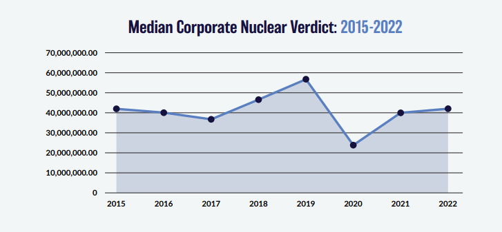
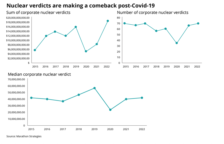
I was thinking more about the post I made last week, and I realised there’s another feature of the graphs that is kind of interesting. None of the graphs adequately isolates what we in insurance would term ‘severity’ inflation. That is, the increase in the average individual verdict over time.
You might think that the bottom graph of the three, tracking the ‘Median Corporate Nuclear Verdict’ does this. If verdicts are increasing on average year by year due to social inflation, then surely the median nuclear verdict should increase as well right?!? Actually, the answer to this is no. Let's see why. Nuclear Verdicts and shenanigans with graphs18/10/2023 If you have seen the below graphs before, it’s probably because they've cropped up quite a few times in various insurance articles recently. They were used by IBNR Weekly [2], Insurance Insider [3], Munich Re [4], Lockton Re [5], and those were just the ones I could remember or which I found with a 5 minute search. The graphs themselves are originally from a report on US social inflation by an organisation called Marathon Strategies (MS for short in the rest of the post) [1].
It's an interesting way of analyzing social inflation, so I recreated their analysis, which lead me to realize MS may have been a little creative in how they’ve presented the data, let me explain. |
AuthorI work as an actuary and underwriter at a global reinsurer in London. Categories
All
Archives
April 2024
|


 RSS Feed