|
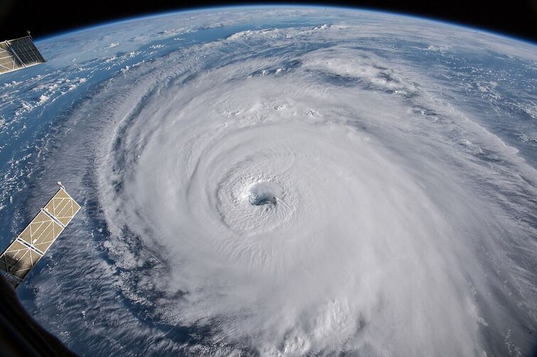
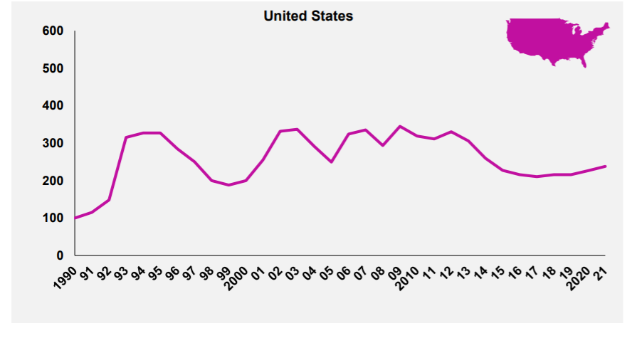
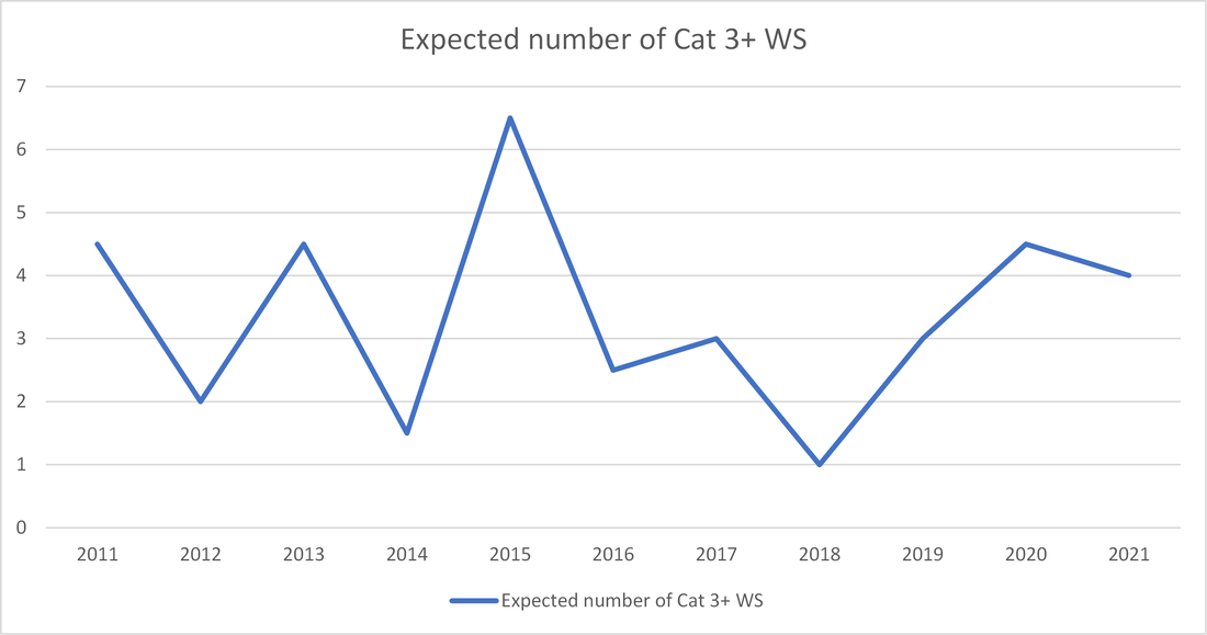
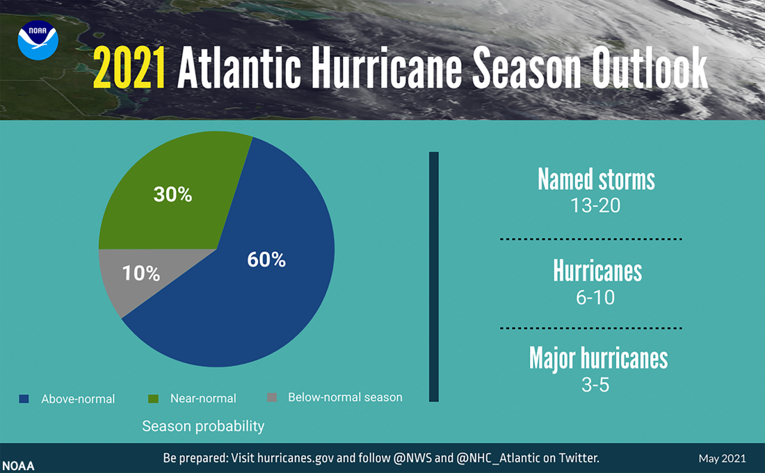
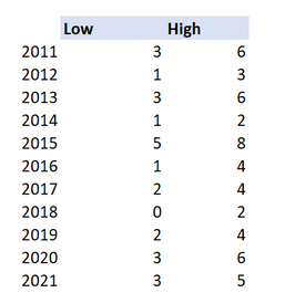
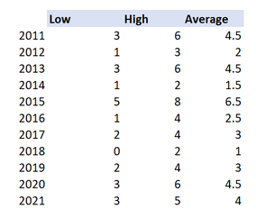
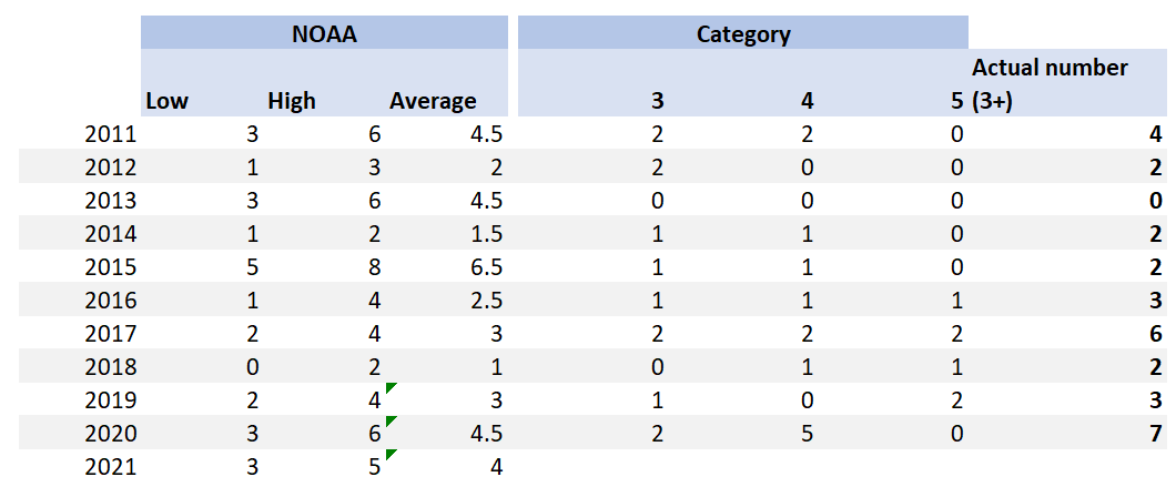
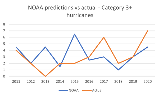
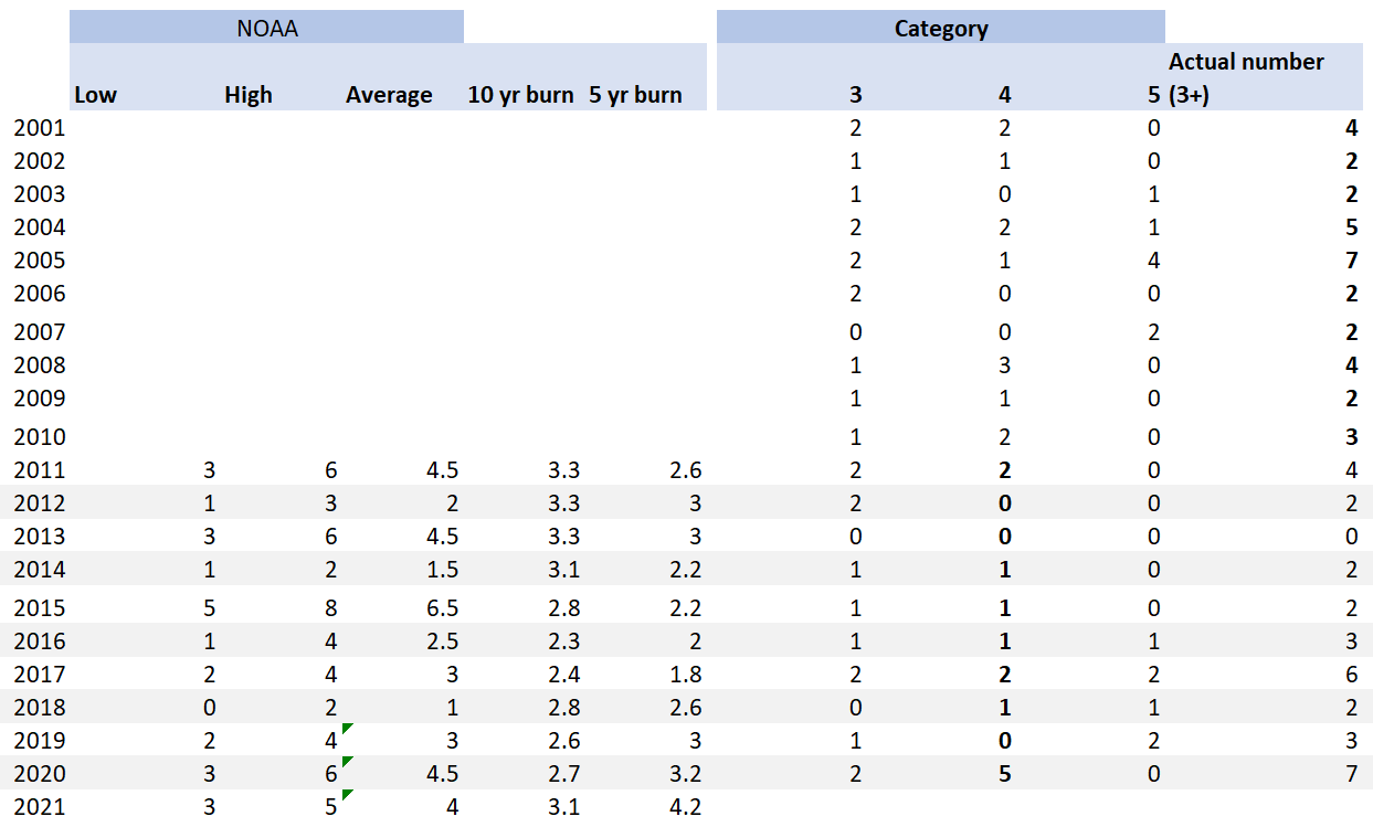
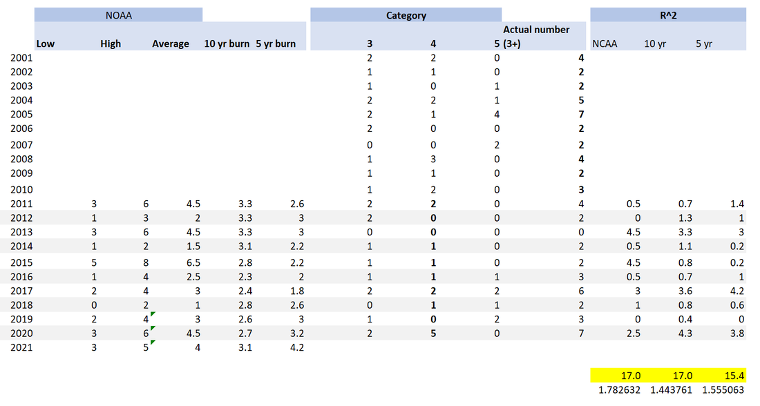
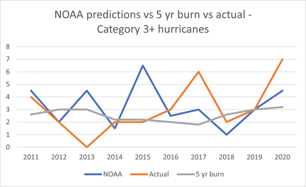
Here are two events that you might think were linked: Every year around the month of May, the National Oceanic and Atmospheric Administration (NOAA) releases their predictions on the severity of the forthcoming Atlantic Hurricane season. Around the same time, US insurers will be busy negotiating their upcoming 1st June or 1st July annual reinsurance renewals with their reinsurance panel. At the renewal (for a price to be negotiated) they will purchase reinsurance which will in effect offload a portion of their North American windstorm risk. You might reasonably think – ‘if there is an expectation that windstorms will be particularly severe this year, then more risk is being transferred and so the price should be higher’. And if the NOAA predicts an above average season, shouldn’t we expect more windstorms? In which case, wouldn't it make sense if the pricing zig-zags up and down in line with the NOAA predictions for the year? Well in practice, no, it just doesn’t really happen like that. Source: NASA - Hurricane Florence, from the International Space Station Reinsurance Pricing To illustrate the fact that reinsurers are not just jacking up their prices, here is a graph showing Willis Re’s US property catastrophe pricing index by year. Willis Re collate info on all the deals they place in a given year for property cat risk in the US, and then measure the average change in price from one year to the next. The graph is indexed to 1990 with a value of 100, so these are not absolute numbers just an index. The graph below was in their April 21 report [1]. The point I’d like you to take away is that, focusing in on the last 10 years, the graph is actually fairly smooth. It moved smoothly down from 2012 - 2017, before moving smoothly up again from 2017-2021. The index swings up and down of the order of +/-10% from one year to the next. Now what about the other side of the equation? What about the NOAA’s predictions? Here is a graph I put together (source explained below) showing the predicted number of ‘Major Hurricanes’ (category 3+) from the NOAA press release from May of the given year: (i.e. 2012 shows a value of '2', which is how many cat 3+ hurricanes the NOAA predicted would occur between Aug 2012 - Dec 2012, in their press release from May 2012) It’s very much not a smooth graph, and moreover the Willis index does not move in line with this graph. For example, in 2014 the NOAA were predicting an expected 1.5 category 3+ storms - a relative low point - in 2015 this jumped to an all time high of 6.5, yet the Willis Re chart actually shows a moderate decline in pricing between 2014 and 2015. The NOAA graph illustrates swings of the order of +/- 200% from one year to the next. Underwriting Cycle Okay, so the Willis index does not match the NOAA prediction of severity, so what does explain the Willis index ? For a couple of interesting takes on what is driving the Willis graph (the shape of which is referred to as the Underwriting Cycle), see the below: [2] ‘Application of Agent Based Modeling to Insurance Cycles’ – Feng Zhou – Link at bottom [3] ‘Modelling the Underwriting Cycle’ – Rene Schnieper – link at bottom The underwriting cycle is a complicated topic which I'm not going to dwell on. The question I'm trying to motivate instead is the following: 'Are reinsurers missing a trick here, and is there actually useful info in the NOAA predictions?' Prior track record In order to answer the question, let’s return to the data we collected. The NOAA puts out an annual press release which looks like the following [4]: Releases for the last 10 years are still available online with a little googling. In this particularly prediction from May 2021, we see the NOAA is predicting between 3-5 ‘Major Hurricanes’, 6-10 ‘Hurricanes’, and 13-20 ‘Named Storms’ for 2021. The hurricane season generally runs from August to December. I collated the predictions from the last 10 years, and to make my life easier, focused just on the selection for ‘Major Hurricanes’ (here defined to be category 3+ storms). The table below shows the predictions made by the NOAA for the number of major hurricanes in each year. I then made the simplifying assumption of taking the midpoint of the high and low to generate a point estimate of the average. I think you could justifiably criticise this step – it’s possible the NOAA had some skew in their model and the mid-point is not actually equal to the median of the low and high, but in order to make this model comparable to another simple model I’m intending to build we need to do something. Let’s see how that looks: (note this is the graph from the intro) Okay, so now we’ve got point estimates of the NOAA forecasts for each year. Let’s overlay the number of events that actually occurred, which can be easily sourced from Wikipedia. So what are we looking at? The first three columns are the NOAA estimates, the last four columns are the actual number of each type of event that occurred. The two columns to compare are the NOAA ‘Average’, and the final column of Actual cat 3+ events. In some years we’ve got some clear successes – 2019 NOAA predicted 3, and we actually had 3. In other years we’ve missed by quite some margin – in 2013 the NOAA predicted 4.5, whereas we actually experienced 0. Here is a graph comparing the two: Burning Costs ‘All very well’ you say, but can you do any better? It’s easy to just point out someone else’s misses, but you need to be able to step up and give us something as good or better before I’ll listen to you. Let’s introduce another ‘baseline’ model to compare it to. I’m going to introduce the model which more than any other, serves as the backbone of the modern insurance industry. What model am I talking about? Random Forests? Gradient boosted trees? GLMs? The collective risk model? Nope… I present – a burning cost, in this case a 10 year burn and a 5 year burn. For each year, let’s take the average number of cat 3+ hurricanes in the preceding 5 year or 10 year window as our prediction for the expected number in that year. So the 10 year burn estimate for 2021 = the average number between 2011-2020. 10 year burn for 2020 = average number between 2010 and 2019, and so on. We see that in 2011, the NOAA predicted 4.5 major hurricanes, the 10 year average was 3.3, the 5 year average was 2.6, and the actual was 4. So in that year the NOAA was the most accurate. In 2015 on the other hand the NOAA predicted 6.5 major hurricanes, the 10 year average was 2.8 and the 5 year was 2.2, and what was the actual? 2. So the NOAA was quite far off in that year. Let’s try to assess the accuracy across all years. We introduce an R^2 value which is equal to sqrt((prediction – actual)^2), and calculate this metric for the three models. Note that a lower number is better here. The final three columns have the R^2 values for the three models, and the values at the bottom are the subtotals. I’ve highlighted these important cells in yellow at the bottom right of the table. Since as noted above, smaller = more accurate, the best model (using our admittedly fairly rudimentary comparison metric) is the 5 year burn, with a value of 15.4. With the 10 year burn performing on-par with the NOAA predictions, both at 17. Here's another graph, this time showing the NOAA predictions, the 5 year burn, and the actual number: Any conclusions?
Let’s return to our original line of reasoning. We wondered whether reinsurers were being short sighted in that that their pricing did not appear to respond to the NOAA predictions. It turns out, based on (the admittedly fairly simple analysis) above, the NOAA projections just do not appear to be very predictive when it comes to estimating the severity of the upcoming hurricane season. In fact, if you were to set the pricing purely based off a 5 or 10 year burn, you would expect the pricing to look like a fairly smooth price index. An above average year of losses would push the pricing up marginally in line with the change in average from one year to the next, and a below average year would push down the index. This change would however occur in a smooth way. So, the shape of the Willis Index is actually consistent with the more accurate prediction model (an averaged view). Caveats, so many caveats To be honest, you could pull apart my analysis in lots of ways. Here are a few of the big weaknesses:
[1] https://www.willistowerswatson.com/-/media/WTW/Insights/2021/04/willis-re-1st-view-april-2021.pdf?modified=20210331214904 [2] https://openaccess.city.ac.uk/id/eprint/12195/1/Application%20of%20Agent%20Based%20Modeling%20to%20Insurance%20Cycles.pdf [3] http://www.actuaries.org/ASTIN/Colloquia/Zurich/Schnieper.pdf [4] https://www.noaa.gov/media-release/noaa-predicts-another-active-atlantic-hurricane-season |
AuthorI work as an actuary and underwriter at a global reinsurer in London. Categories
All
Archives
April 2024
|
 RSS Feed
Leave a Reply.