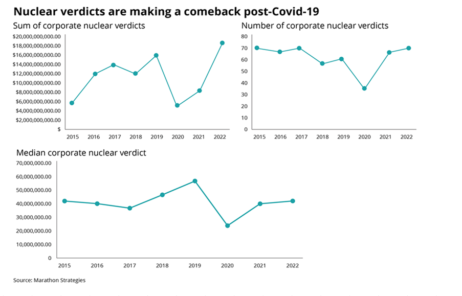
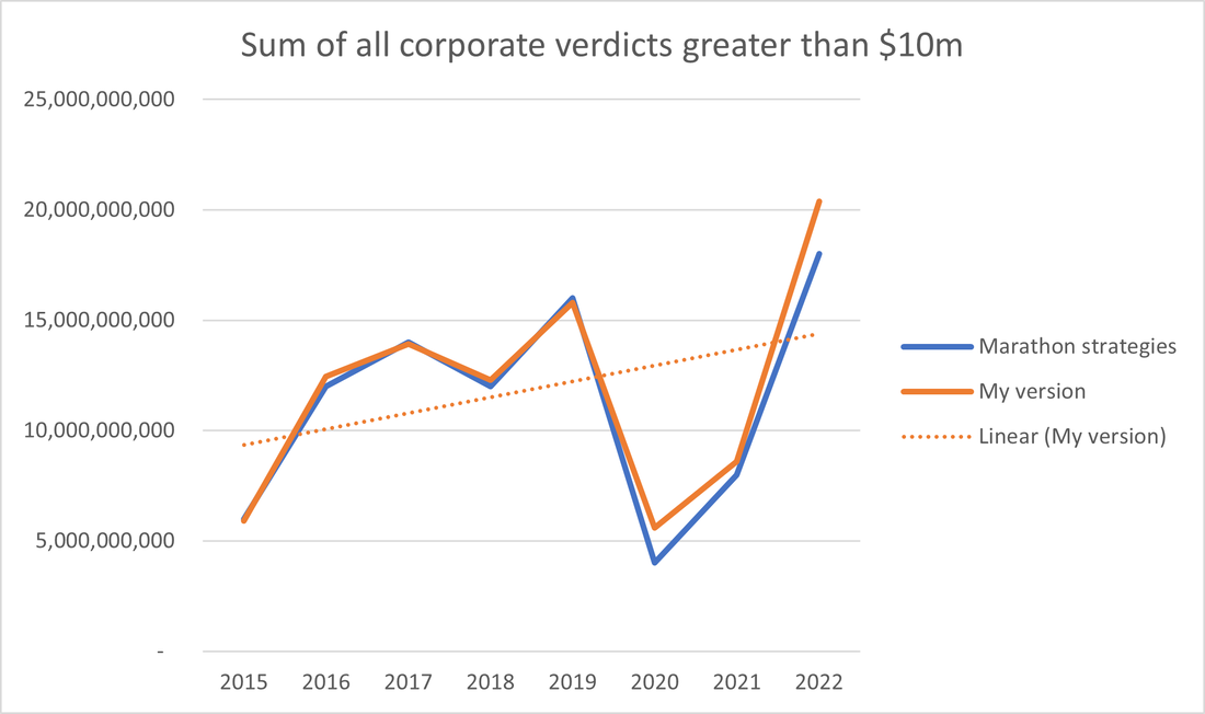
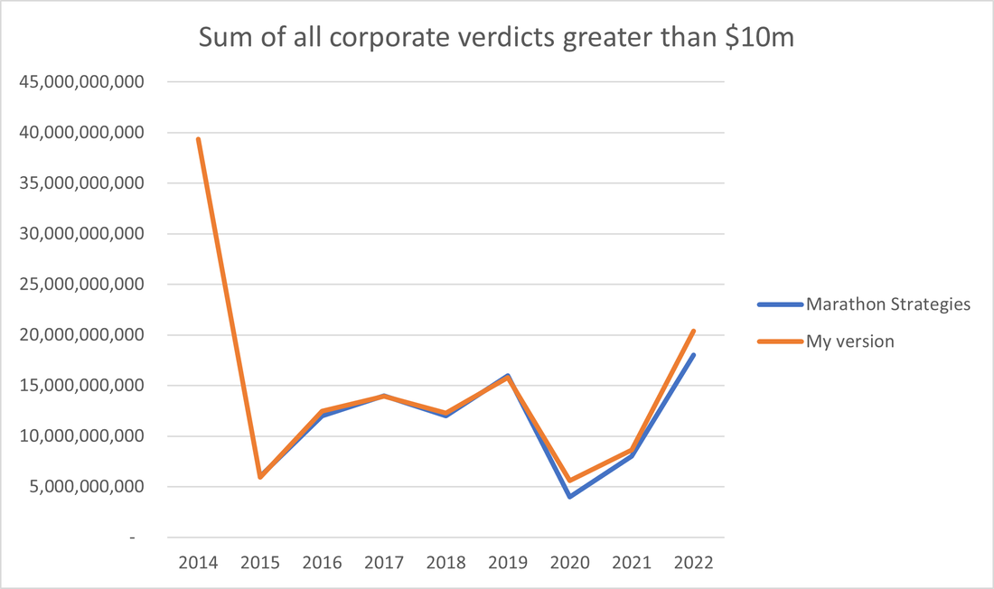
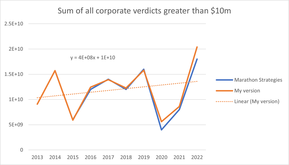
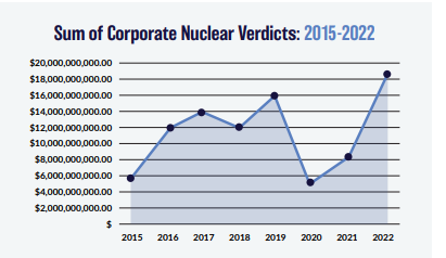
Nuclear Verdicts and shenanigans with graphs18/10/2023 If you have seen the below graphs before, it’s probably because they've cropped up quite a few times in various insurance articles recently. They were used by IBNR Weekly [2], Insurance Insider [3], Munich Re [4], Lockton Re [5], and those were just the ones I could remember or which I found with a 5 minute search. The graphs themselves are originally from a report on US social inflation by an organisation called Marathon Strategies (MS for short in the rest of the post) [1]. It's an interesting way of analyzing social inflation, so I recreated their analysis, which lead me to realize MS may have been a little creative in how they’ve presented the data, let me explain. Recreating the graphs Firstly, can we recreate the analysis? According MS’s report, the data is based on “The National Law Review, LexisNexis, various state and federal court records databases, legal journals, white papers, and media reports, among other sources”. In Blue Peter fashion, I also had a similar dataset of reported US verdicts. I sorted this dataset by year, filtered to just verdicts greater than \$10m, and excluded any verdicts which were not involving a corporate client. I’ve put my version, and MS’s version in the same graph below so you can see the similarity. As a first step this is good, and everything looks as it should! My data is in orange, and MS's is in blue. MS have based their analysis on data which is ultimately sourced from public court info, so we should expect to get something similar when trying to recreate it. For full disclosure, the only manual adjustment I made was to exclude the \$300bn verdict from Texas in 2021, which was so outsized it was completely throwing off my data. I’m assuming MS did the same as they also don't have a \$300bn spike in that year. Now what about the creativity on the part of MS I mentioned earlier? My question - is there anything to the fact that MS have used 8 years of data to create their graph? What happens if we include 9 years instead? Since I've got the underlying data and have recreated their analysis, I can answer that question, here’s the graph: Well that’s a different story! We’ve got a huge year in 2014, and our graph no longer supports the narrative of exponentially increasing awards from 2015 onwards. Firstly, why is 2014 so high? It turns out 2014 was largely driven by a \$25bn tobacco related verdict. Let’s make a couple of adjustments, let's exclude the tobacco verdict as an outlier, and also bump our window up to a more robust 10 years. Here's the updated graph. The point at which MS decided to start the graph, 2015, was the joint-lowest year in the 10 year window. The only year at the same level was a covid year. Of course it’s going to look like a dramatic increase when you are making design choices like that. Just for ease of comparison, here is the graph presented by MS, side by side, with my 10 year graph based on the same data: But what about Social Inflation? Does that mean that there is no such thing as social inflation? Definitely not. Social inflation is very much present in emerging loss data we're all seeing. It's just the specific presentation of this graph that I'm disputing. Conclusions I guess the moral of the story, is be careful taking reports at face value, when you are not able to kick the tires yourself. And also, pay attention to who wrote the report. MS are described as “…an independent PR firm ... We specialize in reputation management, communications, crisis and issues management, creative content, and digital strategy.” [6]. They are very much *not* an academic research outfit. They appear to have done exactly what you would expect such a company to do - they’ve come up with interesting research, using a sensible methodology, and moreover the analysis appears to have been done correctly based on my replication. What they have done on top of that is be quite creative with how they’ve presented the data. If you were looking for a company to hire to do PR communication based on quant research for you, this is exactly what you are looking for! Analysis which is technically correct, but which works in the grey area a bit to tell the story you want told. Would they have made such a splash in the insurance press, had they gone with the possibly more ‘representative of ground truth’ chart which I created using the 10 year view? Probably not. Should Insurance Insider, IBNR weekly, etc. have uncritically copy and pasted the graphs in their reporting? The answer to that is also probably not. [1] Corporate Verdicts go Thermonuclear - https://marathonstrategies.com/wp-content/uploads/2023/03/Corporate-Verdicts-Go-Thermonuclear-0313.pdf [2] IBNR Weekly #41, 2023 - https://www.dowling.com/ibnr_weekly.htm# [3] Insider P&C, 25th April 2023 - https://www.insidepandc.com/article/2bkw885xqkgueh59td91c/commercial-lines/nuclear-verdict-fears-lead-to-caution-as-excess-casualty-rate-rises-taper [4] https://www.munichre.com/en/company/media-relations/media-information-and-corporate-news/media-information/2023/media-information-2023-09-10.html#:~:text=Social%20inflation%20in%20the%20US,US%24%2018.3bn%20in%202022. [5] https://global.lockton.com/us/en/news-insights/why-are-liability-rates-continuing-to-rise [6] https://marathonstrategies.com/ |
AuthorI work as an actuary and underwriter at a global reinsurer in London. Categories
All
Archives
April 2024
|
 RSS Feed
Leave a Reply.