Cefor Exposure Curves - follow up7/3/2022 The Cefor curves provide quite a lot of ancillary info, interestingly (and hopefully you agree since you're reading this blog), had we not been provided with the 'proportion of all losses which come from total losses', we could have derived it by analysing the difference between the two curves (the partial loss and the all claims curve) Below I demonstrate how to go from the 'partial loss' curve and the share of total claims % to the 'all claims' curve, but you could solve for any one of the three pieces of info given two of them using the formulas below.  Source: Niels Johannes https://commons.wikimedia.org/wiki/File:Ocean_Countess_(2012).jpg
Cefor Exposure Curves3/3/2022 I hadn't see this before, but Cefor (the Nordic association of Marine Insurers), publishes Exposure Curves for Ocean Hull risks. Pretty useful if you are looking to price Marine RI. I've included a quick comparison to some London Market curves below and the source links below. 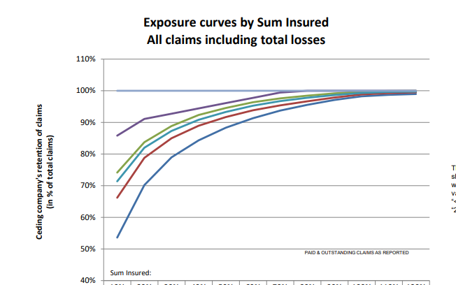 This post is a follow up to two previous posts, which I would recommend reading first: https://www.lewiswalsh.net/blog/german-flooding-tail-position https://www.lewiswalsh.net/blog/german-flooding-tail-position-update Since our last post, the loss creep for the July 2021 German flooding has continued, sources are now talking about a EUR 8bn (\$9.3bn) insured loss. [1] This figure is just in respect of Germany, not including Belgium, France, etc., and up from \$8.3bn previously. But interestingly (and bear with me, I promise these is something interesting about this) when we compare this \$9.3bn loss to the OEP table in our previous modelling, it puts the flooding at just past a 1-in-200 level.  Photo @ Jonathan Kemper - https://unsplash.com/@jupp
Here are two events that you might think were linked: Every year around the month of May, the National Oceanic and Atmospheric Administration (NOAA) releases their predictions on the severity of the forthcoming Atlantic Hurricane season. Around the same time, US insurers will be busy negotiating their upcoming 1st June or 1st July annual reinsurance renewals with their reinsurance panel. At the renewal (for a price to be negotiated) they will purchase reinsurance which will in effect offload a portion of their North American windstorm risk. You might reasonably think – ‘if there is an expectation that windstorms will be particularly severe this year, then more risk is being transferred and so the price should be higher’. And if the NOAA predicts an above average season, shouldn’t we expect more windstorms? In which case, wouldn't it make sense if the pricing zig-zags up and down in line with the NOAA predictions for the year? Well in practice, no, it just doesn’t really happen like that.  Source: NASA - Hurricane Florence, from the International Space Station
German Flooding - tail position - update31/8/2021 This post is a follow up to a previous post, which I would recommend reading first if you haven't already:
https://www.lewiswalsh.net/blog/german-flooding-tail-position In our previous modelling, in order to assess how extreme the 2021 German floods were, we compared the consensus estimate at the time for the floods (\$6bn insured loss) against a distribution parameterised using historic flood losses in Germany from 1994-2020. Since I posted that modelling however, as often happens in these cases, the consensus estimate has changed. The insurance press is now reporting a value of around \$8.3 bn [1]. So what does that do for our modelling and our conclusions from last time? German Flooding - tail position23/7/2021 As I’m sure you are aware July 2021 saw some of the worst flooding in Germany in living memory. Die Welt currently has the death toll for Germany at 166 [1]. Obviously this is a very sad time for Germany, but one aspect of the reporting that caught my attention was how much emphasis was placed on climate change when reporting on the floods. For example, the BBC [2], the Guardian [3], and even the Telegraph [4] all bring up the role that climate change played in the contributing to the severity of the flooding. The question that came to my mind, is can we really infer the presence of climate change just from this one event? The flooding has been described as a ‘1-in-100 year event’ [5], but does this bear out when we analyse the data, and how strong evidence is this of the presence of climate change?  Image - https://unsplash.com/@kurokami04
Bayesian Analysis vs Actuarial Methods21/4/2021
David Mackay includes an interesting Bayesian exercise in one of his books [1]. It’s introduced as a situation where a Bayesian approach is much easier and more natural than equivalent frequentist methods. After mulling it over for a while, I thought it was interesting that Mackay only gives a passing reference to what I would consider the obvious ‘actuarial’ approach to this problem, which doesn’t really fit into either category – curve fitting via maximum likelihood estimation.
On reflection, I think the Bayesian method is still superior to the actuarial method, but it’s interesting that we can still get a decent answer out of the curve fitting approach. The book is available free online (link at the end of the post), so I’m just going to paste the full text of the question below rather than rehashing Mackay’s writing: I received an email from a reader recently asking the following (which for the sake of brevity and anonymity I’ve paraphrased quite liberally)
I’ve been reading about the Poisson Distribution recently and I understand that it is often used to model claims frequency, I’ve also read that the Poisson Distribution assumes that events occur independently. However, isn’t this a bit of a contradiction given the policyholders within a given risk profile are clearly dependent on each other? It’s a good question; our intrepid reader is definitely on to something here. Let’s talk through the issue and see if we can gain some clarity. Exposure inflation vs Exposure inflation18/2/2021 The term exposure inflation can refer to a couple of different phenomena within insurance. A friend mentioned a couple of weeks ago that he was looking up the term in the context of pricing a property cat layer and he stumbled on one of my blog posts where I use the term. Apparently my blog post was one of the top search results, and there wasn’t really much other useful info, but I was actually talking about a different type of exposure inflation, so it wasn’t really helpful for him.
So as a public service announcement, for all those people Googling the term in the future, here are my thoughts on two types of exposure inflation: Excess layer pricing16/9/2020 I had to solve an interesting problem yesterday relating to pricing an excess layer which was contained in another layer which we knew the price for – I didn’t price the initial layer, and I did not have a gross loss model. All I had to go on was the overall price and a severity curve which I thought was reasonably accurate. The specific layers in this case were a 9m xs 1m, and I was interested in what we would charge for a 6m xs 4m.
Just to put some concrete numbers to this, let’s say the 9m xs 1m cost \$10m The xs 1m severity curve was as follows: The St Petersburg Paradox21/8/2020
Let me introduce a game – I keep flipping a coin and you have to guess whether it will come up heads or tails. The prize pot starts at \$2, and each time you guess correctly the prize pot doubles, we keep playing until you eventually guess incorrectly at which point you get whatever has accumulated in the prize pot.
So if you guess wrong on the first flip, you just get the \$2. If you guess wrong on the second flip you get \$4, and if you get it wrong on the 10th flip you get \$1024. Knowing this, how much would you pay to enter this game? You're guaranteed to win at least \$2, so you'd obviously pay at least $\2. There is a 50% chance you'll win \$4, a 25% chance you'll win \$8, a 12.5% chance you'll win \$16, and so on. Knowing this maybe you'd pay \$5 to play - you'll probably lose money but there's a decent chance you'll make quite a bit more than \$5. Perhaps you take a more mathematical approach than this. You might reason as follows – ‘I’m a rational person therefore as any good rational person should, I will calculate the expected value of playing the game, this is the maximum I should be willing to play the game’. This however is the crux of the problem and the source of the paradox, most people do not really value the game that highly – when asked they’d pay somewhere between \$2-\$10 to play it, and yet the expected value of the game is infinite.... 
Source: https://unsplash.com/@pujalin
The above is a lovely photo I found of St Petersburg. The reason the paradox is named after St Petersburg actually has nothing to do with the game itself, but is due to an early article published by Daniel Bernoulli in a St Petersburg journal. As an aside, having just finished the book A Gentleman in Moscow by Amor Towles (which I loved and would thoroughly recommend) I'm curious to visit Moscow and St Petersburg one day.
 If you are an actuary, you'll probably have done a fair bit of triangle analysis, and you'll know that triangle analysis tends to works pretty well if you have what I'd call 'nice smooth consistent' data, that is - data without sharp corners, no large one off events, and without substantially growth. Unfortunately, over the last few years, motor triangles have been anything but nice, smooth or consistent. These days, using them often seems to require more assumptions than there are data points in the entire triangle.
Should I inflate my loss ratios?14/12/2019 I remember being told as a relatively new actuarial analyst that you "shouldn't inflate loss ratios" when experience rating. This must have been sitting at the back of my mind ever since, because last week, when a colleague asked me basically the same question about adjusting loss ratios for claims inflation, I remembered the conversation I'd had with my old boss and it finally clicked. Let's go back a few years - it's 2016 - Justin Bieber has a song out in which he keeps apologising, and to all of us in the UK, Donald Trump (if you've even heard of him) is still just the America's version of Alan Sugar. I was working on the pricing for a Quota Share, I can't remember the class of business, but I'd been given an aggregate loss triangle, ultimate premium estimates, and rate change information. I had carefully and meticulously projected my losses to ultimate, applied rate changes, and then set the trended and developed losses against ultimate premiums. I ended up with a table that looked something like this: (Note these numbers are completely made up but should give you a gist of what I'm talking about.) 
I then thought to myself ‘okay this is a property class, I should probably inflate losses by about $3\%$ pa’, the definition of a loss ratio is just losses divided by premium, therefore the correct way to adjust is to just inflate the ULR by $3\%$ pa. I did this, sent the analysis to my boss at the time to review, and was told ‘you shouldn’t inflate loss ratios for claims inflation, otherwise you'd need to inflate the premium as well’ – in my head I was like ‘hmmm, I don’t really get that...’ we’ve accounted for the change in premium by applying the rate change, claims certainly do increase each year, but I don't get how premiums also 'inflate' beyond rate movements?! but since he was the kind of actuary who is basically never wrong and we were short on time, I just took his word for it. I didn’t really think of it again, other than to remember that ‘you shouldn’t inflate loss ratios’, until last week one of my colleagues asked me if I knew what exactly this ‘Exposure trend’ adjustment in the experience rating modelling he’d been sent was. The actuaries who had prepared the work had taken the loss ratios, inflated them in line with claims inflation (what you're not supposed to do), but then applied an ‘exposure inflation’ to the premium. Ah-ha I thought to myself, this must be what my old boss meant by inflating premium. I'm not sure why it took me so long to get to the bottom of what, is when you get down to it, a fairly simple adjustment. In my defence, you really don’t see this approach in ‘London Market’ style actuarial modelling - it's not covered in the IFoA exams for example. Having investigated a little, it does seem to be an approach which is used by US actuaries more – possibly it’s in the CAS exams? When I googled the term 'Exposure Trend', not a huge amount of useful info came up – there are a few threads on Actuarial Outpost which kinda mention it, but after mulling it over for a while I think I understand what is going on. I thought I’d write up my understanding in case anyone else is curious and stumbles across this post. Proof by Example I thought it would be best to explain through an example, let’s suppose we are analysing a single risk over the course of one renewal. To keep things simple, we’ll assume it’s some form of property risk, which is covering Total Loss Only (TLO), i.e. we only pay out if the entire property is destroyed. Let’s suppose for $2018$, the TIV is $1m$ USD, we are getting a net premium rate of $1\%$ of TIV, and we think there is a $0.5\%$ chance of a total loss. For $2019$, the value of the property has increased by $5\%$, we are still getting a net rate of $1\%$, and we think the underlying probability of a total loss is the same. In this case we would say the rate change is $0\%$. That is: $$ \frac{\text{Net rate}_{19}}{\text{Net rate}_{18}} = \frac{1\%}{1\%} = 1 $$ However we would say that claim inflation is $5\%$, which is the increase in expected claims this follows from: $$ \text{Claim Inflation} = \frac{ \text{Expected Claims}_{19}}{ \text{Expected Claims}_{18}} = \frac{0.5\%*1.05m}{0.5\%*1m} = 1.05$$
From first principles, our expected gross gross ratio (GLR) for $2018$ is:
$$\frac{0.5 \% *(TIV_{18})}{1 \% *(TIV_{18})} = 50 \%$$ And for $2019$ is: $$\frac{0.5\%*(TIV_{19})}{1\%*(TIV_{19})} = 50\%$$ i.e. they are the same! The correct adjustment when on-levelling $2018$ to $2019$ should therefore result in a flat GLR – this follows as we’ve got the same GLR in each year when we calculated above from first principles. If we’d taken the $18$ GLR, applied the claims inflation $1.05$ and applied the rate change $1.0$, then we might erroneously think the Gross Loss Ratio would be $50\%*1.05 = 52.5\%$. This would be equivalent to what I did in the opening paragraph of this post, the issue being, that we haven’t accounted for trend in exposure and our rate change is a measure of the change in net rate. If we include this exposure trend as an additional explicit adjustment this gives $50\%*1.05*1/1.05 = 50\%$. Which is the correct answer, as we can see by comparing to our first principles calculation. So the fundamental problem, is that our measure of rate change is a measure in the movement of rate on TIV, whereas our claim inflation is a measure of the movement of aggregate claims. These two are misaligned, if our rate change was instead a measure in the movement of overall premium, then the two measures would be consistent and we would not need the additional adjustment. However it’s much more common in this type of situation to get given rate change as a measure of change in rate on TIV. An advantage of making an explicit adjustment for exposure trend and claims inflation is that it allows us to apply different rates – which is probably more accurate. There’s no a-priori justification as to why the two should always be the same. Claim inflation will be affected by additional factors beyond changes in the inflation of the assets being insured, this may include changes in frequency, changes in court award inflation, etc… It’s also interesting to note that the clam inflation here is of a different nature to what we would expect to see in a standard Collective Risk Model. In that case we inflate individual losses by the average change in severity i.e. ignoring any change in frequency. When adjusting the LR above, we are adjusting for both the change in frequency and severity together, i.e. in the aggregate loss. The above discussion also shows the importance of understanding exactly what someone means by ‘rate change’. It may sound obvious but there are actually a number of subtle differences in what exactly we are attempting to measure when using this concept. Is it change in premium per unit of exposure, is it change in rate per dollar of exposure, or is it even change in rate adequacy? At various points I’ve seen all of these referred to as ‘rate change’. Beta Distribution in Actuarial Modelling3/11/2019
I saw a useful way of parameterising the Beta Distribution a few weeks ago that I thought I'd write about.
The standard way to define the Beta is using the following pdf:
$$f(x) = \frac{x^{\alpha -1} {(1-x)}^{\beta -1}}{B ( \alpha, \beta )}$$
Where $ x \in [0,1]$ and $B( \alpha, \beta ) $ is the Beta Function:
$$ B( \alpha, \beta) = \frac{ \Gamma (\alpha ) \Gamma (\beta)}{\Gamma(\alpha + \beta)}$$
When we use this parameterisation, the first two moments are:
$$E [X] = \frac{ \alpha}{\alpha + \beta}$$
$$Var (X) = \frac{ \alpha \beta}{(\alpha + \beta)^2(\alpha + \beta + 1)}$$
We see that the mean and the variance of the Beta Distribution depend on both parameters - $\alpha$ and $\beta$. If we want to fit these parameters to a data set using a method of moments then we need to use the following formulas, which are quite complicated:
$$\hat{\alpha} = m \Bigg( \frac{m (1-m) }{v} - 1 \Bigg) $$
$$\hat{\beta} = (1- m) \Bigg( \frac{m (1-m) }{v} - 1 \Bigg) $$ This is not the only possible parameterisation of the Beta Distribution however. We can use an alternative definition where we define:
$$\gamma = \frac{ \alpha}{\alpha + \beta} $$, and $$\delta = \alpha + \beta$$
And then by construction, $E[X] = \gamma$, and we can calculate the new variance:
$$V = \frac{ \alpha \beta}{(\alpha + \beta)^2(\alpha + \beta + 1)} = \frac{\gamma ( 1 - \gamma)}{(1-\delta)}$$.
Placing these new variables back in our pdf gives the following equation:
$$f(x) = \frac{x^{\gamma \delta -1} {(1-x)}^{\delta (1-\gamma) -1}}{B ( \gamma \delta, \delta (1-\gamma) -1 )}$$
So why would we bother to do this? Our new formula now looks more complicated to work with than the one we started with. There are however two main advantages to this new version, firstly the method of moments is much simpler to set up, our first parameter is simply the mean, and the formula for variance is easier to calculate than before. This makes using the Beta distribution much easier in a Spreadsheet. The second advantage, and in my mind the more important point, is that since we now have a strong link between the central moments and the two parameters that define the distribution we now have an easy and intuitive understand of what our parameters actually represent. As I’ve written about before, rather than just sticking with the standard statistics textbook version, I’m a big fan of pushing parameterisations that are both useful and easily interpretable, The version of the Beta Distribution presented above achieves this. Furthermore it also fits nicely with the schema I've written about before (most recently in the in the post below on negative binomial distribution), in which no matter which distribution we are talking about, the first parameter of a distribution gives you information about it's mean, the second parameter gives information about its volatility, etc. By doing this you give yourself the ability to compare distributions and sense check parameterisations at a glance. Pensions and Tax12/10/2019 Pensions and tax you think to yourself - he’s managed to find the two most boring subjects possible and now he appears to be planning to write about a combination of them! Is this some sort of attempt to win an award for the most boring and tedious blog post every? Well what if I told you this blog post, whilst being about pension and tax was also about a burning social justice, about high finance, and about death? Would you find that interesting? Okay, so I may got slightly carried away in that last paragraph and over sold slightly. This is less of a 'burning social injustice', and more an 'unfair outcome' which happens to only affect people who are already well off - but someone has to write about this stuff right? And the current status quo is genuinely unfair I promise. Lifetime Allowance Before diving into the unfairness I mentioned earlier, we need to briefly set the scene. Let’s think about all the types of tax that the government levies on us; we get taxed on our income (income tax), we get taxed on our property wealth (council tax), we get taxed on our wealth when we die (inheritance tax), and we get taxed when we buy things (VAT and other sales taxes). Since the government taxes just about every financial transaction we make, they can tweak all these different types of tax to incentivise and disincentivizes certain behaviours. One thing governments have traditionally been very keen on incentivising is getting its citizens saving enough for retirement. The way this has historically been done is to allow income tax relief on the proportion of an employee’s gross salary which is put into a pension. i.e. If you earn £30,000 and put £5,000 of that into a pension, then you pay no tax on the £5,000 and are then taxed as if you only earn £25,000. You might think to yourself great, so now people are saving more for their retirement and everyone lives happily ever after, the end. Well not quite. The problem with this arrangement is certain unscrupulous individuals started to use this mechanism to avoid paying tax. Let’s say you’re 64, quite well off, and hoping to retire next year, why not chuck most of your money into your pension? You can live off your savings for a year and then all that money you would have taken as income and therefore been taxed on can instead be deferred for a year, taken as pension when you retire, and you would pay no income tax on that year's salary. Or let’s suppose an individual come from a very wealthy family, and doesn't really need to get paid a salary to live on, then they could just put their entire salary into a pension, not take anything until they retire (at 55), and then not pay any tax at all on their earnings from their job across their entire career. Okay, fine, it sounds like we’re going to need some caps on the maximum pension tax relief to stop people doing this. Let’s say – £225k per annum is the maximum that can be put into a pension pot per year, and £1.5m is the total size of a pension pot you can build up before we start making people pay tax. That’s a large amount of money, who’s going to complain about that? These were the levels set by Tony Blair’s government between 2004 and 2006. These caps were then slowly increased over time, reaching a height of around £250k pa, and £1.8m as a lifetime allowance in 2011. These are very big figures, and it’s hard to imagine anyone objecting to a tax on an annual pension contribution above £250k. In 2011, with a rapidly expanding budget deficit to deal with and a promise to balance the books, the Conservative government instigated their infamous austerity programme. The tories had pledged to ring-fence certain areas of government spending (the NHS, and Education for example), they therefore started to look around for other areas to raise additional income which had not traditionally been taped. Tax relief for high earners seemed like an obvious target, and who can really say that the rich should not have to pay additional tax given the situation to help try to protect spending on areas such as policing or social care. By 2014 the annual allowance (the amount that can be saved per annum) had been reduced to £40k per annum, and the lifetime allowance was down to £1m. These values still seem high, however with the economy in the state it was, they are perhaps not as high as they first appear. This reduction came during a period of all-time low interest rates, I'm going to demonstrate which this caused issued by examining a series of graphs. The following graph displays the Bank of England base rate for the last twenty years, notice the significant reduction in 2007 following the global financial crisis. Note we have been at this very low level ever since. 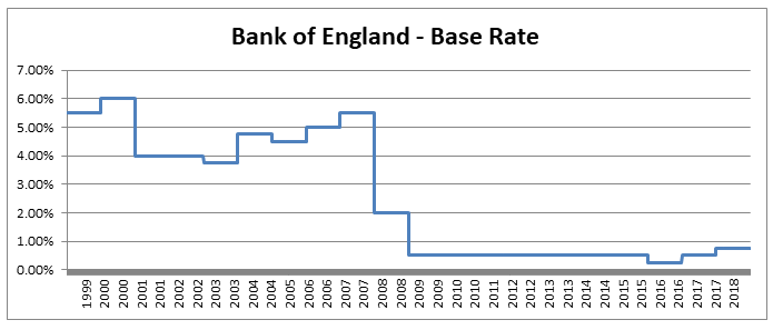 As a proxy for the investment return a pension or life insurance company could receive on a long term almost risk-free investment I’m going to use Base rate + 2%, I've plotted this as well on the graph below: 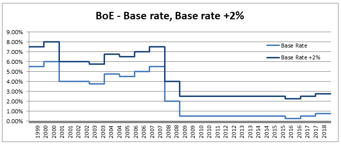 Okay, so why is this important? The interesting idea is that the ‘price’ of an annuity can be approximated using quite a simple formula. It is (very) roughly equal to: $ A = \frac{1}{i} $ Where i is our investment return. What does this mean in real numbers? If I want to retire and get a pension of £10,000 per annum, Then the price of that is going to be 10,000 * A = 10,000 / i. If i=10%, then I will need to have a pot of £100,000. If i = 1%, then I will need a pot of £1m. Let’s plot the implied annuity price on the same chart as a secondary axis: 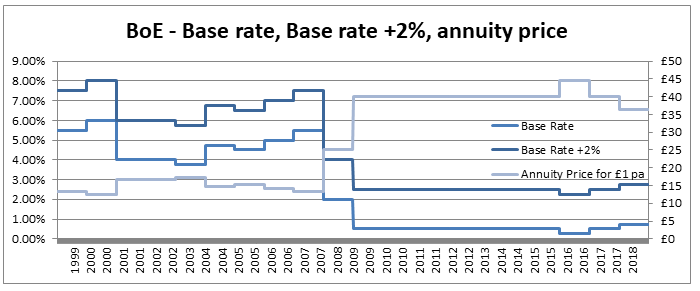 So we see we have this reciprocal relationship, as interest rates go down, the cost of an annuity goes up. At the moment, due to the very low interest rates, it costs something like £37 to purchase an annuity of £1 per annum for life. Interesting you might (or might not) think. But this annuity price becomes useful if we combine it with the lifetime tax-free allowance. If we assume a potential retiree is going to use their pension pot to purchase an annuity, then to calculate the level of pension they will be able to get, we need to take their pension pot and divide by the cost of the annuity. The graph below shows the approximate tax-free pension one could expect if retiring with a pension pot equal to the full Lifetime allowance, using the prevailing annuity rates which are in turn based on the prevailing interest rates. 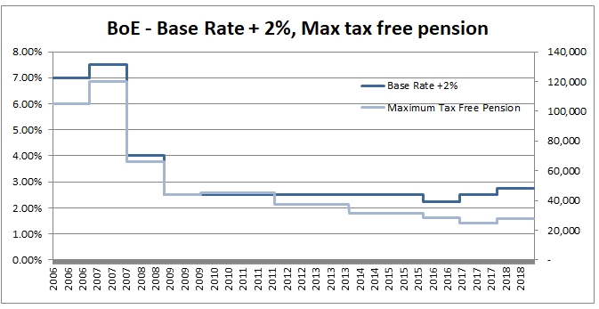 So we see that through a combination of the LTA being reduced significantly and interest rates bottoming out, we are now in the position where the maximum tax-free pension (based on approximate annuity rates) is as little as £25k. A far cry from the approximately £100k when the rule was first implemented. What about that burning social injustice you mentioned? But at least we are all treated the same right? Well not exactly… all of the above glossed over one quite important point, it assumes that the individual in question has a defined contribution pension. For individuals with a final salary pension (which includes MPs, Judges, a majority of CEOs and senior public sector employees), the LTA is calculated with reference to a fixed annuity factor of 20. Given the actual average annuity price is more like 40, this has a massive impact. Let’s plot this on a graph as well. 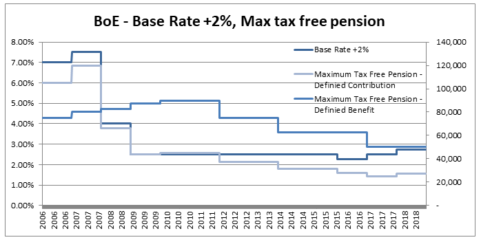 Hmmm, so we see that in 2006 when the LTA was first set up, this factor of 20 was quite generous to Defined Contribution pension holders, they could often retire with a pension of around £120k without paying any tax, whereas a defined benefit pension holder could only retire with a maximum of approx. £80k. This has now flipped, due to changes in annuity rates, and the fact that this factor has not been adjusted for so long. Under current conditions, the maximum pension that can be taken tax free is around £25k pa for a definied contribution pension, but around £50k pa for a definied benefit pension.
So what is the point of all this? What am I advocating? To me it seems clear that we need (approximate) equality of outcome in terms of taxation for defined contribution pensions compared to defined benefit schemes. This could be achieved in one of two ways, either we apply some sort of floor to how low the tax free pension can reduced to for defined contribution pensions, or we adjust the defined benefit annuity factor periodically to keep it roughly in line with market conditions and therefore apply a lower maximum tax free rate to defined benefit pensioners. This would correct the current system by which judges and MPs (and other people with DB pensions) get significant tax breaks at retirement compared to individuals with DC pensions. |
AuthorI work as an actuary and underwriter at a global reinsurer in London. Categories
All
Archives
April 2024
|
 RSS Feed